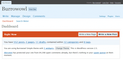
Last night I upgraded to the latest, purportedly-greatest version of the WordPress software for burrowowl.net. I run a few other sites, but generally use this one as my test-bed for drastic changes. Turns out that the much-touted redesign of the administrative interface is leaving me dissatisfied.
On the dashboard, attention was paid to making sure that it can better serve as a quick portal to commonly-required tasks. I’m not seeing much indication that this actually happened, though.
I see a big tomato-red bar that points out where I can write a new page (this site has precisely two pages, not a button I use much) and where I can write a new post. For a first-time user, calling attention to where the “write a post” link is may be a good idea. In the previous version, this was handled by placing a navigation tab named “Write” up near the top of the page. It’s present throughout the administrative interface and its purpose is reasonably self-evident. On the dashboard specifically, there is a “Use these links to get started” section with a list of links. The first one is “Write a post.” Once I’ve used either of these mechanisms a few times, I’m unlikely to spend a lot of time fumbling around looking for it. The red bar is garish and insulting.
Right under the gaudy red bar of shame, the new dashboard informs me of the number of posts, pages, drafts, and categories on my blog. Each number is a link to an interface that allows me to manage my posts, pages, drafts, or categories. For the most part, the only management I do of my categories is to occasionally introduce a new level of granularity (hence there is a DnD category with Iron Kingdoms and Rules subcategories). I am then presented with how many widgets I’m using and given a means of changing my blog’s theme. All of this before my Akismet spam info.
To be fair, Akismet was tucked away too far for my liking in the old interface. Often I open a WordPress admin interface purely for the purpose of reviewing comments, trackbacks, and trapped spam, so these (along with the enigmatic “write a post” tool) are my basic priorities. Getting a quick breakdown of how many messages are awaiting review in Akismet purgatory is a plus.
Back to the negative, though. Like I said, I review comments and trackbacks. In the old interface, a comment would be summarized something like the following: “Joe Blow on Article Title (Edit)” with the commenter’s name being a link to whatever his URL was, the article title being a link to the article, and Edit being a link to the interface that lets me edit that specific comment. This is how I’d get rid of comment spam that wasn’t caught by my other countermeasures. The new interface summarizes thusly: “from Joe Blow on Article Title #” (with the most recent comment showing a brief excerpt before the “from”). The commenter’s name isn’t a link. This obstructs the simple pleasure I find in tracking down what kind of site the commenter runs. It doesn’t totally prevent it, of course, but it’s a minor change that I don’t quite get. The name is there, it’s free real estate in the interface, put a link around the sucker already! The article title is a link to the article, then the hash-mark is a link specifically to that comment (to the anchor WordPress sets for it when the post is displayed). What in the holy heck I’d want that for, I don’t know. Now if I see a comment as being likely spam from the dashboard, I have to take an extra step to get rid of the damned thing. Great.
I suppose I’ll be upgrading my other sites to version 2.5 also, but more from a general aversion to update reminders than from any enthusiasm for the new setup.

I have to update like 7 blogs 🙁 I had just updated them not to long ago… might wait a couple of weeks or do it during the weekend.
Well, good luck, Logtar. I hope you don’t use many plug-ins.
here I come to save the day:
red admin bar can be changed under users/state your name/ change color scheme to old style
Well, that certainly makes it less hideous, takes a bit of the bite out of it. Thanks.