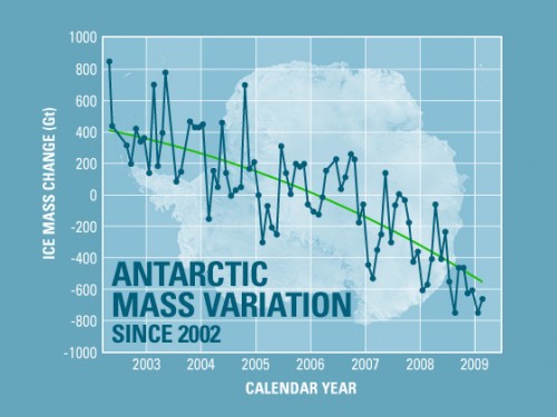
Global Warning, Climate Change, the AlGorePocalypse, whatever you want to call it, there sure are a lot of data floating around about it, and a lot of tempers flaring. I’ll not address the merits of the conclusions people have been drawing from these findings not only because I don’t consider myself to be a qualified expert on the topic, but because I don’t give a rat’s ass. Instead I’m just going to take a look at a graph published by NASA regarding the mass of ice in Antarctic (reproduced above).
Clearly this graph shows a downward trend. The scale on the left shows the rate of change in the mass of ice, and the scale at the scale at the bottoms shows a left-to-right chronology, so downward from left to right is clearly a loss of ice. The caption accompanying this image is “The continent of Antarctica has been losing more than 100 cubic kilometers (24 cubic miles) of ice per year since 2002.” That’s all pretty clear-cut, right?
No, not really. Actually the caption and the graph are at odds with each other. The values shown are not the sum total of ice in Antarctica, but the rate of change of the mass of ice, the first derivative of it. In 2002 we see seven points, all of them above zero. Each represents an increase in the amount of ice in Antarctica. in 2003 there are another ten points, all still above zero. The graph is showing two years of ice growth here. The rate doesn’t dip below zero until the second point in 2004, and doesn’t stay under zero for a majority of samples until 2007. The trendline generated here crosses zero in early 2006, not 2002 as described in the caption.
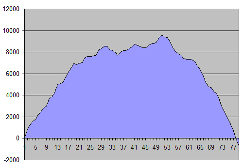
The following is the result of estimating the values shown to produce the integral. I was unsuccessful at finding the actual mass values on NASA’s site, so I just measured (my estimates):
Clearly I didn’t put any effort into sexing up the graph. I also started with a zero value. That is ludicrous, but we’re being somewhat arbitrary about scales here anyway; the NASA graph also gives no indication of whether 1 billion tons is a lot or a little in relation to the total ice mass of Antarctica, so I’ll just assume it’s a heck of a lot and let the graph look big.
There were 78 points on the original graph, but only 36 of them are negative values. In under half of the samples shown, there was a reduction in ice mass. There were four samples shown that I estimated at zero, leaving 38 increases, with a total change over the sample period of -678 billion tons. Bear in mind that the total change from the first sample shown through the 49th is +9587 billion tons. I seriously doubt that anybody in mid-2005 was arguing that global warming was causing a massive ramp-up of ice deposits at the South Pole, at an alarming-sounding rate of 3,200Gt per year. Because that’s what these numbers would have shown.
I don’t think the folks at NASA were malicious in their presentation of this information, but it sure as hell is sloppy. Misleading and contradictory material like this undermines the general case for anthropogenic climate change and poisons the conversation. Don’t piss on my back and tell me it’s El Niño.


I agree,coupled with other not so old,not so fulfilled predictions and the amount of money/potential economic impact confronting global warming can produce, distrust is not unexpected
http://www.time.com/time/magazine/article/0,9171,944914,00.html
The specific bit of misrepresented information this article is about certainly isn’t an isolated case. That scientists just plain get it wrong sometimes (as in the Time article you cite) doesn’t trouble me so much as when it looks like somebody’s deliberately spinning the numbers to serve some agenda or other.
Scientists and doomsayers: lay out the facts honestly. If you’re right, the facts will support you. It you’re wrong and you know it, kindly STFU. We get lied to enough by politicians, and are pretty much topped-off on our bullshit quotas.