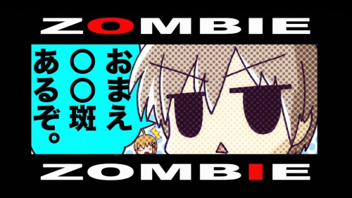
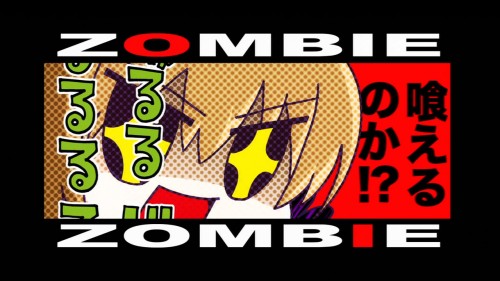
Every once in a while a cartoon comes along where the production team is having fun with it. They probably aren’t all having fun with it (slaving away at in-between frames can’t be pleasant), but some productions find an outlet for at least the appearance of joy. In the case of Kore wa Zombie desu ka, this can be readily found in its bumpers.
Episode one brings us the following:


These are basically just portraits of the male protagonist (the titular zombie) and one of the female leads, a chainsaw-wielding magical girl. It’s just a sight gag. No big deal.
Episode two yields:
A whopping three episodes in, we get:
The strongly-contrasting typography jumps right the heck off the screen here. Considering that this airs to a Japanese audience, having such big, fat, stark foreign words sandwiching your screen is quite a sight. The artistic style, though similar between the first two sets of bumpers, is a far cry from the boobs-and-panties art style of the show itself. Each pairs nicely with the scenes immediately preceding and following. Throw in the fact that they bothered to make new graphics for each episode, and we’re talking about quality approaching Gurren Lagann status here.
And since my title mentions fan service, here you go.


