I’ve been following Tengen Toppa Gurren-Lagann since it originally aired, going so far as to watch the raws before any proper translations are out, I just haven’t been posting about it all that often. 21 episodes in, this series maintains an excellent quality that goes beyond the actual animation production values, its genre clichés, the dialogue, or the silly mecha. Something that I’d been meaning to comment on for a while are the changes to the opening credits and title screens for each episode; as the story develops, the intros change along with it, reflecting the tone and theme of each story arc. Right now it feels like we’re winding towards the end of the third arc, so I figured I’d comment on the previous ones and speculate a little about the next one.
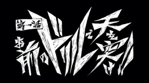
The first few episodes featured a title screen that reflected Simon’s primary influence, Kamina. It, like him, was rough-edged, sloppy, and bold. It looks very much like something he would have scrawled on a brick wall were he literate enough to.
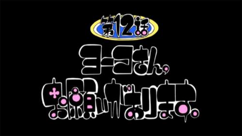
The second set is purely Nia: soft, cute, round-edged, with a bright splash of cheerful colors. Given how gloomy Simon’s outlook is at the beginning of this plot arc, the title screens were a sharp contrast.
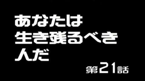
The most recent style reflects the world Rossiu has built up since the fall of Tepperin. It is stark, neat, and orderly. Unlike the previous layouts, this title screen is left-justified.
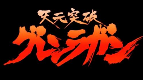
With five or six episodes left, I rather doubt this Rossiu-style title page is going to hold up. Simon is finally catching up with the “Captain GARlock” persona presented at the very start of the story, so I speculate that when Rossiu concedes leadership, we’ll get a new Simon-style. There are two ways I could see this going: one would be a spiral/drill motif, which I would find rather disappointing, the other would be more like the series logo itself, a fiery brush-stroke that conveys a certain spontaneity and boldness of spirit.


